Here are 10 Android UI design tips — plus a bonus one — for improving the user experience of your Android apps.

10 Android UI Design Tips to Improve Your App’s Visual Appeal
When it comes to Android app development, style and design may not trump substance, but they certainly play an important role in whether or not your Android app is successful. Here are 10 Android UI design tips — plus a bonus one — for improving the visual appeal of your Android apps.

Android UI Design Tip #1. Use Appropriately Sized Graphics
When it comes to graphics, many Android app developers take a “one size fits most” approach. While this makes for simpler resource management, it can be a mistake in terms of the visual appeal of your app. In order for an app to look its best, it should include graphics tailored to specific device screens (dimension-wise) as alternative resources. The most appropriate graphics will be loaded at runtime, making for the best user experience possible.
Android UI Design Tip #2. Use Appropriately Formatted Graphics
We’ve all seen apps that grind to a halt while trying to load some gigantic graphic file that is not only the wrong size, but a less-than-ideal format. The Android platform supports a number of media formats, such as PNG, JPEG, GIF, BMP and WebP (Android 4.0+). PNG is the ideal format for lossless images, while JPEG quality is “tweakable.”
Android also supports stretchable graphics with Nine-Patch. Consider using WebP, when available, in place of JPEG, as it may be a more efficient choice when it comes to storage and download sizes. That said, if used as a separate set of images alongside older formats, the overall package size will be larger, offsetting any benefits of using the newer format.
Android UI Design Tip #3. Apply Subtle Animations and Use Colors to Display State Changes
Applying subtle animations during screen transitions and UI control color differentiation to communicate application state changes adds professional flair to your applications. For example, fading between activities makes screen transitions less jarring, while changing the color of a button control when it is pressed highlights a user action as it is taking place, clarifying what the user is doing.
Turning on hardware acceleration, available on Android 3.x and later, may allow animations to run more smoothly. But test well, as not all features are available when hardware acceleration is enabled for the app.
Android UI Design Tip #4. Soften the UI with Rounded Corners
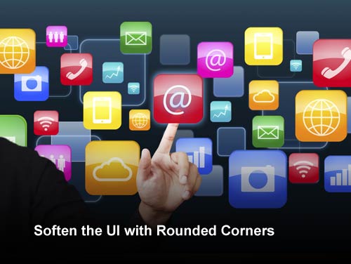
Each user interface control, such as a Button or ImageView, takes up a rectangle of pixels on the screen, but it need not be a harsh, pointy-cornered deal. Soften the look of the user interface by using rounded corners on your controls — a very Web-like style, yes, but popular with users.

Android UI Design Tip #5. Use Consistent “Lighting” for 3-D Effects
The newer versions of the Android platform use holographic styling, 3-D icons, and the like. If you are providing your own controls with drop shadows and other such styling, make sure you use consistent “lighting” — in other words, make sure the shadows are all consistently oriented on a screen. Likewise with gradients; use consistent values in your graphics editor (such as Photoshop) to create consistent gradients and textures.

Android UI Design Tip #6. Use High-Contrast Color Schemes for Easy Viewing
You know how you cringe the first time a family member (usually of an older generation) discovers colored fonts and backgrounds, and sends you an impossible-to-read email with lemon yellow text on a white background, or fuchsia on orange? Well, some people design applications with screens that make it difficult to read or navigate. Use moderately high-contrasting color screens for easy viewing without harsh eye strain. Start with the color schemes provided as part of the system resources and work from there.

Android UI Design Tip #7. Use Large, Readable Fonts and Font Styles
Just like bad color schemes, we’ve all had family members send us unreadable text in some wacky font that was likely designed by demented, calligraphy-obsessed monks who drank too much mead. Certain fonts are easier to read than others.
Font size is also a factor — make the font as big as possible without losing the balance with other screen features. Just like with a fax machine, fonts below 12pt are usually not a good idea.
The designers of Android 4.0 (Ice Cream Sandwich) designed a new font just for the platform — one that is easy to read on a mobile device. It’s called Roboto.

Android UI Design Tip #8. Don’t Deviate Too Far from Platform Norms
Many of the most successful mobile applications leverage user interface patterns that users are familiar with. They have simple, streamlined user interfaces that use controls as they were intended to be used. Don’t try to be too different when it comes to user interface controls and screen design. Just keep it simple and in line with how the rest of the platform behaves. Use the platform as a cue for how your app should look and behave.
If you are creating a UI that is different, make sure to use objective methods such as user studies and A/B-style testing to compare against a more traditional version of your UI to determine if it is better — i.e. more efficient, easier to use, and perhaps more pleasant looking.
Android UI Design Tip #9. Follow Documented UI Guidelines
The Android documentation includes many UI guidelines to incorporate into your app. These guidelines often vary depending on the version of Android on which your app will appear. When this happens, you’ll need to include alternate resources to cover multiple guidelines. The guidelines cover icons of all types, widgets, menus, and activities.

Android UI Design Tip #10. Beta Test Your App User Interface
Developers do not make good QA or beta testers. After your app is reasonably stable, it’s usually worthwhile to perform some true beta testing with users completely unfamiliar with your application design and intentions. App designers often assume users will find their application UIs intuitive when they may not. Only by putting your app in front of users can you discover any unanticipated issues before you publish.

Bonus Android UI Design Tip: Consider a Professional Artist or Graphic Designer
These days users expect an application to look polished and professional. Just like you wouldn’t go to a job interview in your pajamas, you shouldn’t publish apps without spending a reasonable amount of resources making the app look awesome. In many cases, code monkeys are not very skilled artists, so it’s worth hiring a professional to help you out. Just make sure you are clear about the requirements — mobile design is a specialty.

Conclusion
When you’ve had your head down developing your Android app, it’s easy to forget about the user interface design. It’s a good idea to walk through this list after your application is relatively stable and add some professional polish. These tasks are generally best left until late in the development lifecycle when screen content is relatively stable, as it makes no sense to tweak and perfect contents your app won’t be using at publication time.